Kulapat Yantrasast of wHY Architecture has made L&M Arts on Venice Boulevard a new affable art compound in L.A.
In terms of viewing art, an art gallery is conceived by many as a place that is not very accessible. These notions were formed partly because the crowd that frequents art galleries consists mostly of people who make up the art circles, such as art collectors or the upper classes of people. The other reason could also be the tight security maintained at galleries to protect artworks. Kulapat Yantrasast, an architect who is the founder of wHY Architecture in Los Angeles had a different conceptual approach in designing an art gallery. He wanted it to be a place that is open and affable in order to make it easier for passers-by to access.

 View from courtyard to the new gallery surrounded by sculpture garden. View from courtyard to the new gallery surrounded by sculpture garden.
Photo by Iwan Baan
L&M is one of the major art dealers with great influence in the American art scene. Originally, they had a gallery in New York but due to many well-known artists, museum directors and curators moving to L.A. and the rapid increase of activity in the art scene, they decided to open another gallery there. Another reason for opening a new gallery is that the L&M's exhibition space in New York was no longer sufficient.
L&M's new branch is in Venice, L.A. that was founded by the millionaire Abbot Kinney, whose original intention was to build vacation homes resembling the city of Venice in Italy. Moats and canals were dug, piers and an amusement park were built and houses and villas were also constructed for sale. The City Hall building, fire station, and the city's very own power station were located at the centre of the project. Later, Abbot Kinney, whom people thought to be a little crazy, went bankrupt. Thus Venice became an abandoned town and a place for conducting illegal activities, which is why the city got its nickname of 'Dog Town'. Interestingly, Venice is also the birthplace of skateboarding. Finally, Venice was officially included as part of L.A. and the city centre buildings were sold and used for other purposes. One of the buildings, the city's power station has been used in several different forms such as an architect's office, artist's studio, theatre, blueprint shop and, most recently, it became part of L&M Art gallery's space.

Tension between the 'old' and the 'new'
Photo by Iwan Baan
This project is situated on a site that has an odd triangular shape and consists of three major parts: the old brick power station built in 1929, the new gallery building, and the office area. Kulapat explained about the planning concept saying that due to the sunny and dry weather of L.A., there is a relaxed atmosphere in the city itself. Thus he wanted to focus on the exterior spaces as well. So he designed a courtyard surrounded by both the old and the new buildings, with the corner of the new building facing the old building. He said that he wanted to create "a dance between the old and the new; the old which was made lively again by the new and the new residing within the old", and both these pavilions are situated among the sculpture garden.
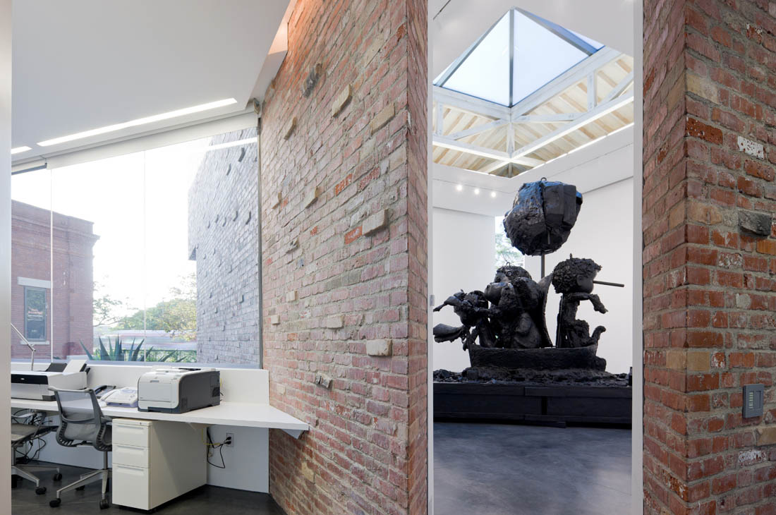
Walking into the building that used to be the old power station, the first eye-catching feature were not the artworks on display but it was the ceiling above with its long rectangular skylight, which also has fabric as another layer of light filter to make the natural light coming into the interior space softer. Edges of the ceiling are designed to be extra thin, making the ceiling look very light and seemingly floating in the space. It reminded us of the architectural installation, Sky-space by James Turrell. The floor of this building hasn't been changed much, traces of usage and channel pipes that were part of the power station are still visible, but it has been cleaned and tidied up. As the nature of a gallery needs for it to have a wide white coloured wall for displaying art works, most of the windows in such spaces are closed off. However, instead of closing all the windows the architect chose to keep some parts open and reveal the existing brick walls and concrete roof.

Ceiling of this gallery reminds me James Turrell's Skyspace
Photo by Iwan Baan
Viewed from the street the new gallery building looks like it is a square but actually it is a diamond-shaped building. This becomes more obvious from the inside. The external walls are made from two types of bricks. Mainly used are recycled bricks salvaged from downtown Los Angeles building remains, added to which are bricks that slightly protrude from the wall. The later type of bricks are made by using the traditional burning process and in this instance, only the ones that were a little flawed were selected. These flawed bricks are called ‘clingers'; they are the bricks that were too close to the fire during the burning process, thus coming out twisted and bent. Kulapat said that he wanted to create a beauty of imperfections; every inch of the brick wall does not need to be neat and smooth.

New gallery's Skylight
Photo by Iwan Baan

Clinger brick wall
Photo by Iwan Baan
As in the old building, the highlight of the new building is also the skylight. There is no fabric layer beneath it but the timber-structure roof is exposed. The de-saturated grey colour of the timber gives the building an antique look. A corner of the gallery is left open with a high window on one side facing the front and towards the street. This allows people passing to see the exhibitions happening inside. He nicknamed it the 'sexy window'. Not only does this window serve as a link between the space outside and inside, it also allows visitors to know where they are in the building. The next corner is a door opening into the sculpture garden outside, and at the other corner is the door connecting to the office.

Office space
Photo by Iwan Baan
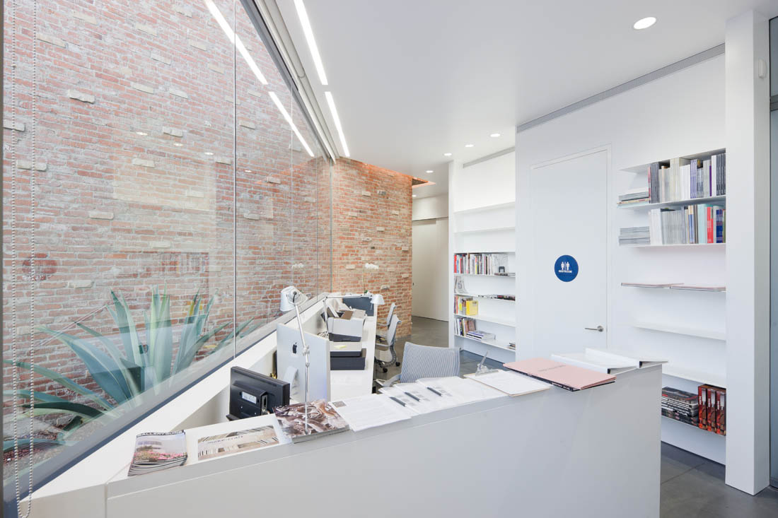
The office building is triangular-shaped and located between the old and new buildings. The materials, a glass wall and washed gravel wall in grey colour tones used for the exterior are completely different from both the galleries. Other than being in harmony with the two gallery buildings the glass wall makes the courtyard feel even more airy, and the surface of the mirror also reflects the interaction between the old and the new building. Trees planted in the garden in front of the office area create a cool and pleasant atmosphere and also help conceal the management area and the artworks that are stored at the back of the office.
The interior space comprises of reception area, general office, owner's office, and a private viewing room. A square-ish working desk and table is seen while walking inside, and it looks somewhat thin and light conflicting with its purpose of use. Kulapat explained that the owner asked him to design furniture that would go with the building's design. So the concept of furniture design started with the diamond shape of the building, which was then twisted and interlocked. The material used is steel-sheets and even though it looks thin and light, in reality it is very heavy and stable.

Owner's room
Photo by Iwan Baan

Private viewing room and twisted tables designed by Kulapat
L&M Art gallery was officially launched late last year with an exhibition of works by Paul McCarthy, which was very well received by the press, people in the art circle, and by those who live or work in the area. The day we visited the gallery also happened to be the day they were preparing a new exhibition by Thomas Houseago, a popular artist of the new generation. We observed that many driving or walking past the gallery stopped and visited the exhibition inside and outside.
It can be said that Kulapat's objective to give people easier access to experience art is successful to a certain extent already.

view from Venice Boulevard


detail where 'old' and 'new' meet.


‘sexy window' allows pedestrians to peek inside the gallery space.

Thomas Houseago's works

detail


Site Plan

Elevation

Sections

Section
Thank you Kulapat and wHY Architecture for the information about this project.
This article was originally published in art4d magazine # 181, and republished by courtesy of art4d magazine. |